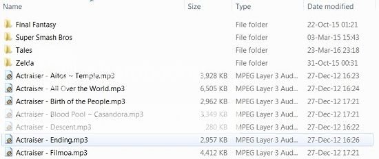
You all recognize this. It's a screenshot from Explorer. It displays your files in an efficient and organized manner so you can access them with ease. I can organize them alphabetically, by size, the date modified, file type, and because these are mp3s, album, artist, track number... We've had this on computers as long as I can remember because it fucking works.
Somehow Apple didn't get that memo and I've noticed as the years pass, they move away from that. I've been complaining about iTunes for awhile, but this in particular is probably the most fundamental problem. The whole point of iTunes is to manage your music, specifically on your mobile devices. When I first started using the program, it looked a lot like that screenshot above. And that was fine! That's what I'm expecting. A fucking list of my music that displays as much information at once so I know how they're tagged.

Someone at Apple thought icon mode was the way to go, and it's driving me nuts. All that information is gone. And now because so much space is dedicated to this picture of the icon, I have to start scrolling to look at my files when I could've just seen it on one screen. Some people like icons better, which is totally cool, but at least give me the fucking option to return to a list!
No comments:
Post a Comment